On this page
Use these instructions to build your forms.
Form components include:
- reusable elements like templates and base forms
- controls used to build the form like textboxes, calculations, and HTML content
- a control editor to change how the form fields work.
Address
Refer to the Data Dictionary - Address
Breakouts
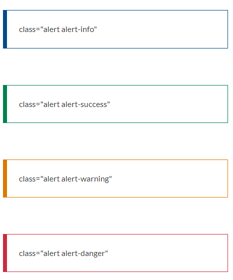
The iApply form has a number of built-in style classes that can be used to style elements within forms.
The alert boxes provide a way of highlighting a small amount of text to make it stand out on a page. Alerts should be used sparingly on the form. They must be used consistently, which means having a clear purpose and using the correct one.
General guidance:
- be absolutely clear about why the alert is needed
- when the user needs to do something, let them know what they need to do and make the task as easy as possible
- don't overdo it - too many alerts will either overwhelm or annoy the user and they are more likely to ignore them.
Use Controls - HTML Content or the iApply classes listed below.
Buttons
A button should only be used in a form for linking to an action. The button wording should be short.
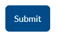
Common buttons include - 'Back' 'Save' 'Next' 'Submit' 'Attach file'.
Bottom left on pages - from the first page to the

Bottom right on pages.
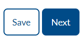
Bottom right on the 'Review and submit' page
Calculations
Use Controls - Calculation

Date and time
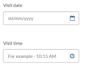
The date and time pickers allow the user to click on the calendar icon and or time icon and select a date or time, or enter data manually.
Don't use the date and time pickers when you’re asking users for a date they’ll already know. For example - date of birth, or something you can look up without using a calendar, like today's date.
Use Controls - Date and Time
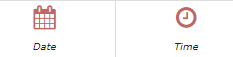
In the Control Editor add Placeholder Text so the user knows how to add the date or time manually.
Date 'dd/mm/yyyy'
Time 'For example - 10:15 AM'
Web view:
Dropdown list
A dropdown allows users to choose 1 or more options from a predefined list of options.
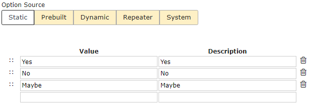
Use Controls - Combobox with one of these option sources - static, prebuilt, dynamic, repeater, or system.

The advantage of a dropdown list is that it can reduce errors by constraining the options to those in the list and ensuring that users enter data in the proper format.
However:
- Very long dropdowns should be avoided as they require scrolling making it impossible for users to see all their choices in one glance. They also require careful steering of the mouse so that it does not leave the dropdown.
- Avoid dropdown boxes when typing may be the faster option eg street type or postal delivery type. Free text input into fields with restricted options does require data validation on the backend, but, from a usability perspective, it's often the best way to go.
- Avoid dropdown boxes for data that is highly familiar to your users, such as the day, month, or year of their birth. Such information is often hardwired into users' fingers and having to find these options in a long menu is tedious, breaks the previous guideline, and can create even more work for users.
- Dropdown lists tend to be either too short (not covering all options) or too long (when trying to cover all scenarios). It is better to have a shorter list covering the most common options with an additional option Other with a free text field for the user to fill out if needed.
For shorter lists when users are selecting 1 option radio buttons can be used as an alternative to dropdown lists.
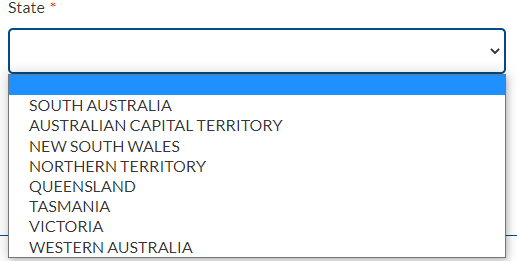
Dropdown lists are usually in alphabetical order though you can put the most common option first. For example, Australian states and territories put South Australia first.
Web view:
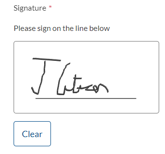
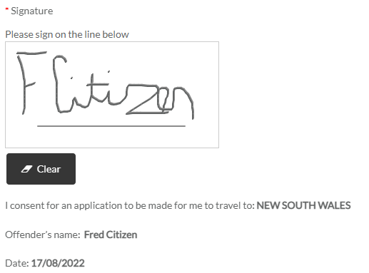
Electronic signature
The electronic signature feature can be used in lieu of, or in addition to a stand-alone checkbox eg a declaration.
Use Controls - Signature Pad
Web view:
The text 'Please sign on the line below' is hardcoded and will automatically display in the web view.
A Controls - HTML Content control can be added below the Signature Pad control to add additional content about the signature. For example web view:
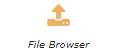
File uploads
You should only ask users to upload something if it’s critical to the delivery of your service.
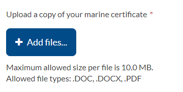
Use Controls - File Browser.
Defaults in Control Editor:
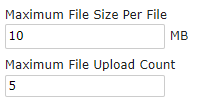
Default web view:
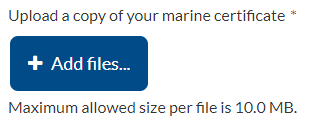
You can also include the file types allowed.
File types in Control Editor:
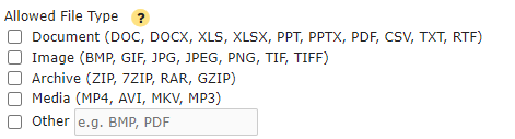
File types web view:
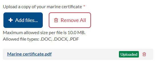
Once the file is uploaded web view:
Total file uploads throughout the form should be kept to under 20 MB.
Refer also to the Data dictionary - File upload
Hide or show fields
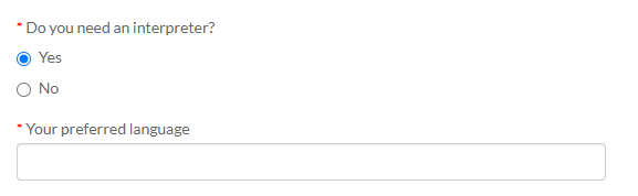
The hide or show field conditional logic feature is used if you want to show or hide follow-up questions depending on the user’s answer.
In this example, the question 'Your preferred language' only shows on the page if 'Yes' is selected for the question 'Do you need an interpreter?'
Use Control Editor - Business Rules
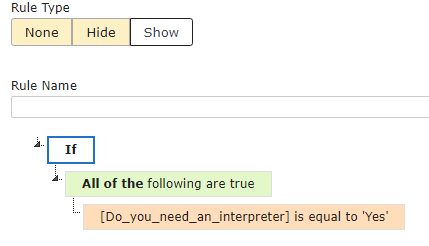
Web view:
HTML
Use Controls - HTML Content

Hyperlinks
Refer to SA.GOV.AU - Links
Labels
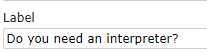
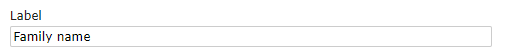
All form fields should be given text labels or question labels as described in the Data dictionary.
In the Control Editor - Labels add the name of the field.
Label text should be short, direct, and in sentence case. Do not start labels with the text 'Please'.
Don't use a full stop at the end of the label, if it is a question end with a ?
Web view:
Option lists
Options can be used in lots of ways. Here is an example of a simple static
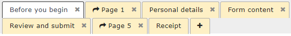
Pages
Use sentence case
Page headings must always use sentence case.
Before you begin
The starting point for public-facing transactions should be a service page, known as a call to action page, on SA.GOV.AU. This page includes a description of the service, what the user will need before they start, and eligibility requirements.
Filtering questions regarding eligibility on a 'Before you begin' page should only be included if experience shows that users consistently get this wrong.
Most forms should start with the ‘Personal details' page.
Form content
This name should reflect what the page is about, for example, 'Vehicle specifications.
Add pages
Pages can be added by clicking on the '+' and moving the new page to the preferred location.
Radio buttons and checkboxes
The use of radio buttons and checkboxes should be consistent throughout the form. Radio and check box options are displayed vertically.
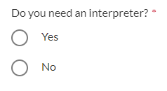
Radio buttons
Use Controls - Radio Group to select a single option from a list.

In Options add item names, for example
Web view:
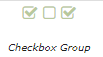
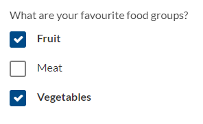
Checkboxes
Use Controls - Checkbox Group when a user can select more than one option from a list - each check box is independent of all other checkboxes in the list, so checking one box doesn't uncheck the others.
Web view:
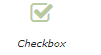
Use the Controls - Checkbox when a stand-alone single option is required - for example, a declaration.
Web view:
Repeater groups
If a field has the potential for multiple entries or the field is a hidden field, the field name should reflect the type of data that is required to be entered.
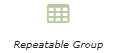
Use Controls - Repeatable Group.
By default, when a vertical repeater group is used in a form and summary fields are not used in the group, each item appears like this:
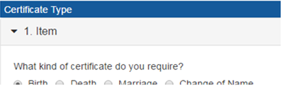
'Item' is a generic term and cannot be changed. A workaround for this is to create a text field in the group, with the label name being whatever you want the word 'Item' to be replaced with (in this case, ‘certificate details’).
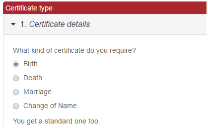
The field name should reflect the data that the user is required to enter - ie another address or security details, certificate details.
Leave the text field with no default value and set it to be hidden in the field business rules. Then you can modify the group setting to use this new field as a 'summary field' and the word 'Item' will be replaced:
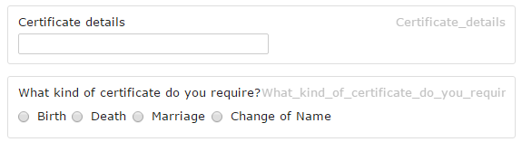
The fields will display on the form as:
Help text
Help text should be added to the repeater group to instruct the user on how to add another item to the group.
For a table repeating group, add a HTML control immediately prior to the group.
For a vertical repeating group, add a HTML control immediately after the group.
The content control will be: 
<b> To add another [requirement], click on the + symbol</b>
A requirement represents the information the user is required to enter - ie additional child information, another course.
HTML code to add more items
HTML code for adding add more button icons in the form:
<div class="alert alert-info">
Note: If you need to add an additional "field name" use the <i class="fa fa-plus-circle"></i> Add more button.</div>
Required fields and validation
All required fields are shown with an asterisk next to the field label.
Data entered is validated at either the field level or page level.
Field level validation
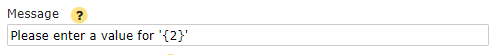
The iApply default error message for mandatory fields is 'Please enter a value for '{2}' where 2 is the label.
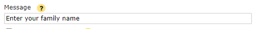
The error message should be changed to 'Enter (name of the required field)'. The error message field is found in the Control Editor.
Page validation
Page validation ensures that all mandatory or required fields have been completed and all dependencies have been completed. The error message should be displayed when the next page and/or submit button is selected. If any required fields have not been entered, the required field is highlighted and the unanswered question is highlighted to the user in the error message.
The page validation or error messages should be positioned at the top or the bottom of the form. The form can't be submitted until all required questions have been completed.
Page validation rules can be configured using the page validation tab. The error message location can also be selected.

Required fields
The asterisk '*' denotes the required fields.
Tooltips
Don't use tooltips. Use placeholder or information alerts instead.